Everything is linked...
I was working for a customer since December on a really big project. During development, they ask me to show training journey with an original chart (they had a prototype but it was not really understandable). They also saw several charts really interesting among which Network one. That is why I try to do it!
I was really glad to succes the Network chart but I was also thinking about maintenance... and about that I was really pessimistic! Indeed, for me it could be "easy" to maintain the workbook and the dashboard but for my customer I was not sure (mainly due to a lack of time). So the evening, when I was at home, I was thinking about an other solution to do it. And the following day, I rolled up my sleeves and started to do some SQL!
So after dataset creation, there is the most important part of the job: build the chart! To do it, I used (one more time!) trigonometry! And yes, it was painful... again... But I was really glad when my chart appears on my screen! To have it displayed correctly, I created two calculated fields in Tableau. These two fields (named
 To hide the point corresponding to the star (due to
The first field compare a parameter To have a better design, I created 3 other fields, all 3 for formatting my chart. These fields allow me to display the right category and the right course for each circle.
 The last step is to have some formatting stuff such as delete lines and grid, hide axis, change font and color... and voilà!

Feel free to leave a message or a note about this work.First try
First I try to build a dataset in Excel based on a MySQL export. It was succesful but really annoying because I had to refresh the file each time a training is insert in the database... Moreover I added a background image to have lines. But if I ddid it like this it was because I thought the analysis was a "one shot" piece of work. I have to note that I built this first chart with a development database. Indeed, Data integration was not ended and validated by users when I started to work on this dashboard.I was really glad to succes the Network chart but I was also thinking about maintenance... and about that I was really pessimistic! Indeed, for me it could be "easy" to maintain the workbook and the dashboard but for my customer I was not sure (mainly due to a lack of time). So the evening, when I was at home, I was thinking about an other solution to do it. And the following day, I rolled up my sleeves and started to do some SQL!
Build a suitable dataset
I write a query which allow me to create lines. Trainings were really specific because of a hierarchy: the first package is the "father" of the two others. So I try to structure my query to have a hierarchy in the lines. To do this, I usedUNION (not with Tableau because I worked with a version 9.0) to create links between training's packages (just like Joshua Milligan (aka VizPainter) explains in his article). Just below, this is my query:select
'reseau' as `type`,
null AS `ID`,
tt.code AS `CODE_FORMATION`,
null AS `DATE_OBTENTION`,
null AS `duree_formation`,
null AS `code (network_dim)`,
tt.categorie AS `categorie`,
tt.line as `line`,
tt.orderpoint as `orderpoint`
from (
select
t.categorie,
t.code,
t.line,
t.orderpoint as orderpoint
from (
select
c1.categorie,
trim(c1.code) as code,
concat(c1.categorie,"-",c1.code) as line,
2 as orderpoint
from network_dim c1
union all
select
c2.categorie,
null as code,
concat(c2.categorie,"-",c2.code) as line,
1 as orderpoint
from network_dim c2
union all
select distinct
c4.categorie,
null as code,
if(c4.categorie='A',concat(c4.categorie,"-",c3.categorie),
if(c3.categorie=c4.categorie,concat('A',"-",c3.categorie),null)
) as line,
if(c4.categorie='A',1,2) as orderpoint
from network_dim c3
join (select cc.categorie from network_dim cc) c4
where if(c4.categorie='A',concat(c4.categorie,"-",c3.categorie),
if(c3.categorie=c4.categorie,concat('A',"-",c3.categorie),null)
) is not null
and if(c4.categorie='A',concat(c4.categorie,"-",c3.categorie),
if(c3.categorie=c4.categorie,concat('A',"-",c3.categorie),null)
)!='A-A'
) t
order by t.categorie, t.code) tt
[orderpoint] and [line] which they are essential to build the lines. Actually, I am not entirely satisfied because there still are hard-coded variables... I am still thinking about another solution more dynamic! But, with this query, I can refresh my data to have informations about employees and their training journey. Otherwise, to have informations about employees, I added a second UNION to my query. This UNION allow me to have all the informations baout employees such as their names, age, job, graduation date...
Great! Now let's do the chart!
So after dataset creation, there is the most important part of the job: build the chart! To do it, I used (one more time!) trigonometry! And yes, it was painful... again... But I was really glad when my chart appears on my screen! To have it displayed correctly, I created two calculated fields in Tableau. These two fields (named
X and Y) gives me coordinates for each training and category. Let's have a look to them:
if isnull([categorie])=false and isnull([Corr])=true then
    case [categorie]
        when 'A1' then 2
        when 'A' then 0
        when 'A2' then -2
    end
else
    case [categorie]
        when 'A' then
            case [Corr]
                when 'Notions de base' then cos(pi()/([nb_formation_cat]-1))
                when 'Construire un graphique' then cos(2*pi()/([nb_formation_cat]-1))
                when 'Tableau de bord' then cos(3*pi()/([nb_formation_cat]-1))
                when 'Source de données' then cos(4*pi()/([nb_formation_cat]-1))
                when 'Actions' then cos(0)
            end
        when 'A1' then
            case [Corr]
                when 'LoD Calcul' then cos(0+pi()/4)+2
                when 'Trucs et astuces' then cos(2*pi()/([nb_formation_cat]-1)+pi()/4)+2
                when 'Géocodage' then cos(3*pi()/([nb_formation_cat]-1)+pi()/4)+2
            end
        when 'A2' then
            case trim([Corr])
                when 'Administration' then cos(6*2*pi()/([nb_formation_cat]+1)+pi()/4)-2
                when 'Web Authoring' then cos(2*pi()/([nb_formation_cat]+1)+pi()/4)-2
                when 'Monitoring' then cos(2*2*pi()/([nb_formation_cat]+1)+pi()/4)-2
                when 'Autorisations' then cos(3*2*pi()/([nb_formation_cat]+1)+pi()/4)-2
                when 'Conffiguration' then cos(4*2*pi()/([nb_formation_cat]+1)+pi()/4)-2
                when 'Installation' then cos(5*2*pi()/([nb_formation_cat]+1)+pi()/4)-2
            end
    end
end
[Corr] is corresponding to "training_code" in my dataset. So the calculation (here it is X field) has two parts: the first one test with a case function the [categorie] and gives me the coordinates. This is the circle for each [categorie]. On the other hand, the second part of the calculation test each [Corr] for each [categorie] and gives me coordinates also (this part is really annoying for me because there is a lot of thing "hard-coded"...). Obviously, Y field has the same construction. Okay! So now, let's have some drag & drop!
The best part of the job!
So to build the chart, we have to put theX field in the columns shelf and the Y one in the rows shelf (theses fields have to be aggregated with an average). We can put [line] in the detail and [orderpoint] in the path too. After this, we put [categorie] as an ATTRIBUTE in the color shelf. That gives us this:
ATTR([categorie])), we just have to do a right click on the color legend and choose "Hide". This is the first part of the chart. To do the second part, we have to duplicate the X or Y field (in the exemple, I choose the X). The second field will not be a line chart but a shape (in the Mark shelf). To have the most efficient effect, we have to create some calculated field. Let's have an explanation.The first field compare a parameter
[ID] and the field [ID]. This field is essential.
Field [FILTRE_ID]

[Paramètres].[ID]=[ID]
[ID], chosen by my parameter, took the course or not. Indeed, as the formula shows below, I ask Tableau to do a distinct count of my [FILTRE_ID]. If the distinct count is equal to 1 I return 1, if not I return 2.
Field [formation_shape]

if countd([Paramètres].[ID]=[ID])=1 then '1' else '2' end[FILTRE_ID] to display the right date for the right ID.
Field [formation_date]

if [FILTRE_ID]=true then [DATE_OPTENTION] end[formation_shape] goes in the color and [formation_date] in the label as an attribute.


When to use it?
As an exemple, I choose to use it to display training's monitoring. My idea here is to have a dashboard allowing people to follow each employee and its training's journey. The parameter allow to choose an employee and see data about it!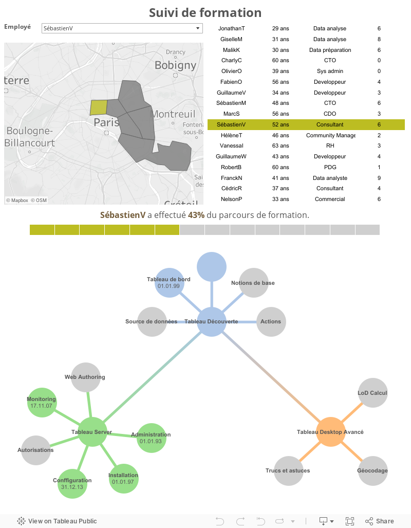
Thank you!
Thank you for expalninig such a great tool tableau with examples.one of the recommanded blog.we suggest this blog our Friends.very useful to tableau leaners and professionals
ReplyDeleteTableau Online Trainigs in Hyderabad
Tableau Online Trainigs in usa
This comment has been removed by the author.
ReplyDelete