IronViz Contest - Part 1: Qualification
Here is my first blog post about Tableau Software, my job tool. This blog will try yo present and explain my work with Tableau Desktop with customers and Tableau Public with Open Data. I will try to give some tips about Tableau and to explain some tricky vizzes.
This first blog post comes after #DATA14, the Tableau Conference which took place in Seattle a month ago. I had a chance to be a part of this story thanks to my qualification for the IronViz contest. This post will try to give an answer at this question: how did I win the Storytelling Viz Contest ? I am going to explain my viz (Les Accidents de la route en 2012).
1. Roads accidents story
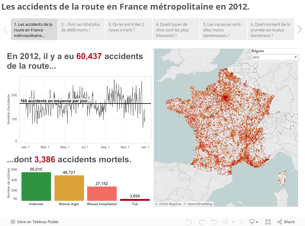
The visualisation which allow me to go to Seattle in September is available here (in french). This is a story built with 6 différent parts. Each part presents a specific point of view and try to answer a specific question. In fact each part is a dashboard and these dashboards are built with the same method: 3 or 4 views (more views will give too much informations), a map in each dashbord (the map is always on the upper right) and a comment to give the main information on the upper right. About the Story, the aim was to give a general analysis on the 1st point to go to specific analysis for the other points.
2. Hours of work and weeks of analysis
This visualisation is built on strong analysis. The datas (available here: data.gouv.fr) were analyzed and analyzed again to create a first prototype. After that, my dear colleagues had tested the viz to have a feedback. This step allow me to change analysis, graphes, colors, etc. In fact, this process is important to have a final version because it includes several iterations. Each version of the workbook had changes about analysis but noew graphes and views too. The aim of this process is to provide an easy but efficient experience to the users!
3. Fast & Furious by Tableau !
This part of the post will explain how I did a beautiful car in Tableau. The car was the longer development of the viz. To create this graphe, I had to use a specific dataset which I created directly in Tableau. I used the annotation feature and a picture of a car to create cartesians coordinates. I found a drawing of standard car on the Internet to be able to create points (of course, I can't draw a car myself!).

The first step was to keep in mind the size of the picture. Indeed, this size was used to tell Tableau Desktop to use this picture as a background. I chose to divide by 2 the width because it was easier to create all the points: the Y axis was in the middle of the sheet so I just had to do a symetrical operation to have all the car.

Through the annotation feature, I create several points corresponding to the right side of the future car. Nest, I had duplicated with an axial symtrical operation (that keeps the car geometry and divides the creation time by 2 !!). All these points was put in an Excel file used as a TDE in Tableau.

The second step was to put some colors and try to design a road. To do this I used the zero line to draw the middle road band and I chose a background color as grey to do the road itself. Moreover, I created 2 reference bands that I put in green to represent roadsides.

The last step was to use the "car dataset" with the blending feature. This feature allowed me to put metrics on the different parts of the car. I used a ratio aggregation
count([nb_accidents])/total(count([nb_accidents])) and checked that the result was alright.
4. Some design and... Voilà!
After all the iterations I had to do the conditioning. To be simple I chose to use a white background. I chose tu use red-green divergent palette because the red color means hazardous situations and it was important to show where it is very dangerous (the more is red, the more is lethal).
All this work allow me to really test the storypoints feature. I think this feature is a really good one because you can analyze the same dataet several times with different point of view. On the other hand, I hope that this part of Tableau will be more flexible especially with formatting options and link between the story and the dashobards or sheets. But, yeah, it is very powerful.
You want to read this post in French ? Click here.
No comments:
Post a Comment