When is my next train?
Currently I am lucky because I have some time to create vizzes with Tableau 10. I am very curious about Device Designer efficiency and use. That is why I did a couple weeks ago a viz about french wine. This week, I used Open Data about subway in Paris (again!). Since my first wiz about Paris' subway, I want to show visualisation about time and trip. that is why I chose GTFS files (all data are available here : GTFS files).
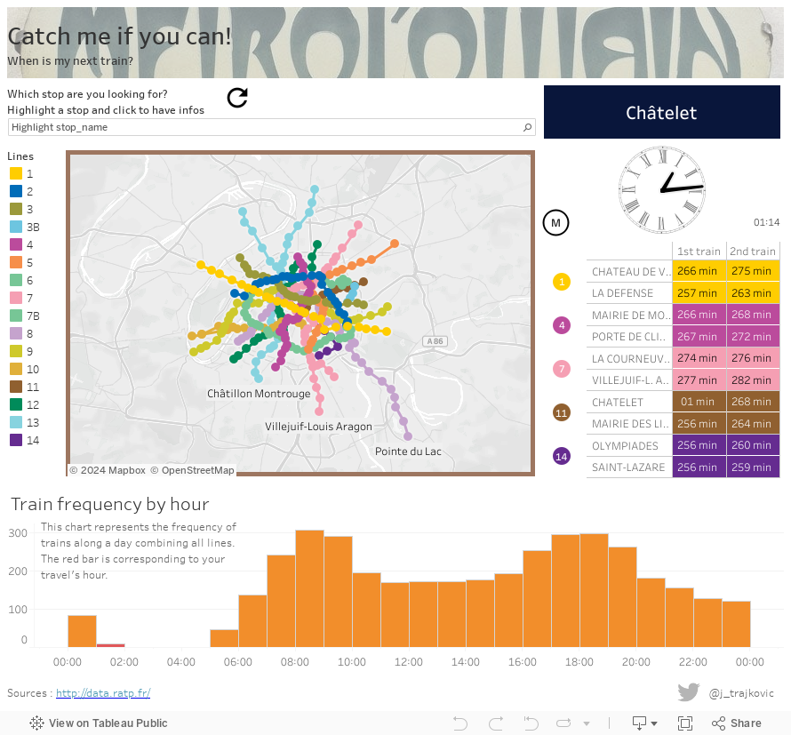
My main idea was to create a viz giving next train for each stop in function of the time you are viewing the viz. I knew it was possible in Tableau because, yes, almost everything is possible with Tableau... So I started to donwload data and look into the files. For once, data are really good, well structured and clean. Several files are available. I chose "RATP_GTFS_LINES" archive because it seems to be easier to recognize subway's lines. Here is a screenshot of the dashboard :

My main idea was to create a viz giving next train for each stop in function of the time you are viewing the viz. I knew it was possible in Tableau because, yes, almost everything is possible with Tableau... So I started to donwload data and look into the files. For once, data are really good, well structured and clean. Several files are available. I chose "RATP_GTFS_LINES" archive because it seems to be easier to recognize subway's lines. Here is a screenshot of the dashboard :

Union 'em all!
OK. So first I told me : "You just have to union all files with Tableau and go for analysis!"... Well... Almost... Unfortunately, I find an issue with union feature. Indeed, I guess it is because my computer is french and CSV in France is seperated by semi-colon and not comma. In Tableau, when I put my first file I just had to specified that the seperator is comma and not semi-colon (by default, as I told before, Tableau is thinking that seperator is semi-colon). Everything was OK. But when I wanted to union a second file, here is the issue : Tableau did not apply configuration to the second file. It gives me a wrong union with all my second file in a column... I was really disappointed because I had 16 files to union for each tables (and I had 5 tables in my datasource). So with a lot of regret, I chose to use an ETL (talend in that case). After this step, I put all my data in Tableau and I was another time disappointed because there was too much rows in my source (for Tableau Public). After a long thought, I chose to only keep a week (already more than 1,600,000 rows). And that's it : my datasource was ready to go!
OK. So first I told me : "You just have to union all files with Tableau and go for analysis!"... Well... Almost... Unfortunately, I find an issue with union feature. Indeed, I guess it is because my computer is french and CSV in France is seperated by semi-colon and not comma. In Tableau, when I put my first file I just had to specified that the seperator is comma and not semi-colon (by default, as I told before, Tableau is thinking that seperator is semi-colon). Everything was OK. But when I wanted to union a second file, here is the issue : Tableau did not apply configuration to the second file. It gives me a wrong union with all my second file in a column... I was really disappointed because I had 16 files to union for each tables (and I had 5 tables in my datasource). So with a lot of regret, I chose to use an ETL (talend in that case). After this step, I put all my data in Tableau and I was another time disappointed because there was too much rows in my source (for Tableau Public). After a long thought, I chose to only keep a week (already more than 1,600,000 rows). And that's it : my datasource was ready to go!
Let's get it started!
My first sheet was, of course, a map. Almost everyone in Paris knows the subway map! To create the map, as usual, I used stops, lines and a pointorder. The pointorder is corresponding to the the position of the stop along the line. This gives me the following map :

We can see that there are points on lines corresponding to stops. I used a double axis allowing me to have to "layouts" : one for the lines and one for the stops. After building this map, I tried to use the real path of lines (available as an open data file) but it was to heavy to join all the real path and all the GTFS files (to heavy for Tableau Public, if I want to do this for a Tableau Server it is possible!).
My second sheets was about frequency of trains. Indeed, I told me it could be interesting to have a chart showing how many trains are going through a stop. To do this I used a count dictinct of trips. In GTFS you have stops, stop_times and trips. A trip is corresponding to a travel on a line (so for stops which have several lines such as Châtelet (5 lines), you have more trips than a stop with 1 line!). To have a good presentation I put a time axis on X axis. This time axis is cut by hour for one day. This gives a good view on how many trains are going through a stop in 1 hour. Here it is :

Finally, for this chart, I want to show where you are when you are viewing the viz : this is the red bar.
The third part of the dashboard is about next trains. It was the most difficult part to create not because of technically issue but more about desing. Indeed, I woould like to recreate a subway dock with the same pane and all the equipment... but it was too hard to do. I chose to just reproduce the name of the station and the pane giving next trains. That is why you will find a digital clock, the name write un white on a blue background, the subway line and a table with next trains. The clock is just a "bonus" and it was a challenge for me...

In this part of the dashboard, there are 6 sheets : the stop's name, the clock, the little "M", time as a number, subway's lines and the table with next trains. Technically, there are 2 complicated sheets : the clock and the table.
About the clock, I used once again trigonometry. As I did with radar chart and as Andy Kriebel did it too in his blogpost about monthly radar chart, I created 2 calculated field corresponding to X axis and Y axis. To create a clock, it is the same way than to create a monthly radar chart. Indeed, there are 12 hours on a clock so you just have to use π/6 angles (you can cut your trigonometry circle into 12 slices so 2π/12). This gives me the basis of my calculated field. The other part is about drawing the lines. My first idea was to create a second datasource with all the rows and columns needed to draw the clock.

As you can see on the picture, there are 4 columns. I chose to cut the time by minutes. I created a column measure giving me 2 values : hour and minute, and a pointorder giving me 1 and 2 (or 0 and 1). The column value gives for the measure hour the hour of time and for the measure minute minutes of time. These 4 columns allow me to create the hands of a watch. To draw the watch, I create a sheet organized like this :

I used a background image to give me the marks of a watch. As you can see, Pointorder is used to give the path for lines and to give the size. There is another calculated field create directly in the mark shelf corresponding to this : dateadd('hour',9,now()). This gives me the hour (I used dateadd() function to be at my locale time in France. Indeed, Tableau Public server seems to be in the USA and the now() function gives me the US time... The two calculated fields used to create the watch are just below :
Calculation for [Xaxis]
if [Pointorder]=1
    then
        if datepart('hour',dateadd('hour',9,[arrival_time]))=datepart('hour',dateadd('hour',9,now()))
        and datepart('minute',dateadd('hour',9,[arrival_time]))=datepart('minute',dateadd('hour',9,now()))
            then
                if [Measure]='hour'
                    then
                    -cos(datepart('hour',dateadd('hour',9,now()))/12*2*pi()+pi()/2)*0.5
                    elseif [Measure]='minute'
                    then -cos(datepart('minute',dateadd('hour',9,now()))/60*2*pi()+pi()/2)
                    else 0
                end
            else 0
        end
    else 0
end
Calculation for [Yaxis]
if [Pointorder]=1
    then
        if datepart('hour',dateadd('hour',9,[arrival_time]))=datepart('hour',dateadd('hour',9,now()))
        and datepart('minute',dateadd('hour',9,[arrival_time]))=datepart('minute',dateadd('hour',9,now()))
            then
                if [Measure]='hour'
                    then
                    sin(datepart('hour',dateadd('hour',9,now()))/12*2*pi()+pi()/2)*0.5
                    elseif [Measure]='minute'
                    then sin(datepart('minute',dateadd('hour',9,now()))/60*2*pi()+pi()/2)
                    else 0
                end
            else 0
        end
    else 0
end
I chose to multiplicate the hour calculation by 0.5 to have the little hand of the watch smaller than the minute hand.
With this "second datasource" method I had an issue with the filter action coming from the map of my dashboard... So I give another way to create the watch based on my main datasource. I played with subway's lines to create hands of the watch. Indeed, my filter action is not filtering on lines so I can use it to draw the clock. I had to create a new more field corresponding to the point order. The calculted fields are quite different and I had to create a new more field called Pointorder :
Calculation for [Xaxis]
if datepart('hour',[arrival_time])<>datepart('hour',dateadd('hour',9,now()))
    then
        if [ligne_originale]='1' then -cos(datepart('hour',dateadd('hour',9,now()))/12*2*pi()+pi()/2)*0.5
            elseif [ligne_originale]='2' then -cos(datepart('minute',dateadd('hour',9,now()))/60*2*pi()+pi()/2)
            else 0
        end
    else 0
end
Calculation for [Yaxis]
if datepart('hour',[arrival_time])<>datepart('hour',dateadd('hour',9,now()))
    then
        if [ligne_originale]='1' then sin(datepart('hour',dateadd('hour',9,now()))/12*2*pi()+pi()/2)*0.5
            elseif [ligne_originale]='2' then sin(datepart('minute',dateadd('hour',9,now()))/60*2*pi()+pi()/2)
            else 0
        end
    else 0
end
Calculation for [Pointorder]
case [ligne_originale]
    when '1' then 1
    when '2' then 3
else 2
end
With those fields my new sheet is organized like this :

Of course, in all of my field I used the function now() to be based on the current time.
Finally for the table giving next trains, I used some table calculations (rank_unique) to define next trips in function of the current time. The calculated field used to define next trips is quite simple :
Calculation for [all_next_trip]
if
    maketime(datepart('hour',[arrival_time]),datepart('minute',[arrival_time]),0)
    >=
    maketime(datepart('hour',dateadd('hour',9,now())),datepart('minute',dateadd('hour',9,now())),0)
then
    str(maketime(datepart('hour',[arrival_time]),datepart('minute',[arrival_time]),0))
end
The rank_unique() function is computing along this field in an ascendant order. This allows me to display only the first and second trains.
After all these sheets, I built the dashboard and put some filter actions. The most important is the filter action coming from the map and filtering all the other sheets. I also put a "refresh" button because I found that Tableau Public used cache and does not display correctly the current time. So if there is a mistake when you view the viz just try to click on the refresh button.
I hope this post was interesting and useful! Here is the final viz!
Feel free to leave a message!
My first sheet was, of course, a map. Almost everyone in Paris knows the subway map! To create the map, as usual, I used stops, lines and a pointorder. The pointorder is corresponding to the the position of the stop along the line. This gives me the following map :

We can see that there are points on lines corresponding to stops. I used a double axis allowing me to have to "layouts" : one for the lines and one for the stops. After building this map, I tried to use the real path of lines (available as an open data file) but it was to heavy to join all the real path and all the GTFS files (to heavy for Tableau Public, if I want to do this for a Tableau Server it is possible!).
My second sheets was about frequency of trains. Indeed, I told me it could be interesting to have a chart showing how many trains are going through a stop. To do this I used a count dictinct of trips. In GTFS you have stops, stop_times and trips. A trip is corresponding to a travel on a line (so for stops which have several lines such as Châtelet (5 lines), you have more trips than a stop with 1 line!). To have a good presentation I put a time axis on X axis. This time axis is cut by hour for one day. This gives a good view on how many trains are going through a stop in 1 hour. Here it is :

Finally, for this chart, I want to show where you are when you are viewing the viz : this is the red bar.
The third part of the dashboard is about next trains. It was the most difficult part to create not because of technically issue but more about desing. Indeed, I woould like to recreate a subway dock with the same pane and all the equipment... but it was too hard to do. I chose to just reproduce the name of the station and the pane giving next trains. That is why you will find a digital clock, the name write un white on a blue background, the subway line and a table with next trains. The clock is just a "bonus" and it was a challenge for me...

In this part of the dashboard, there are 6 sheets : the stop's name, the clock, the little "M", time as a number, subway's lines and the table with next trains. Technically, there are 2 complicated sheets : the clock and the table.
About the clock, I used once again trigonometry. As I did with radar chart and as Andy Kriebel did it too in his blogpost about monthly radar chart, I created 2 calculated field corresponding to X axis and Y axis. To create a clock, it is the same way than to create a monthly radar chart. Indeed, there are 12 hours on a clock so you just have to use π/6 angles (you can cut your trigonometry circle into 12 slices so 2π/12). This gives me the basis of my calculated field. The other part is about drawing the lines. My first idea was to create a second datasource with all the rows and columns needed to draw the clock.

As you can see on the picture, there are 4 columns. I chose to cut the time by minutes. I created a column measure giving me 2 values : hour and minute, and a pointorder giving me 1 and 2 (or 0 and 1). The column value gives for the measure hour the hour of time and for the measure minute minutes of time. These 4 columns allow me to create the hands of a watch. To draw the watch, I create a sheet organized like this :

I used a background image to give me the marks of a watch. As you can see, Pointorder is used to give the path for lines and to give the size. There is another calculated field create directly in the mark shelf corresponding to this : dateadd('hour',9,now()). This gives me the hour (I used dateadd() function to be at my locale time in France. Indeed, Tableau Public server seems to be in the USA and the now() function gives me the US time... The two calculated fields used to create the watch are just below :
Calculation for
[Xaxis]if [Pointorder]=1
then
if datepart('hour',dateadd('hour',9,[arrival_time]))=datepart('hour',dateadd('hour',9,now()))
and datepart('minute',dateadd('hour',9,[arrival_time]))=datepart('minute',dateadd('hour',9,now()))
then
if [Measure]='hour'
then
-cos(datepart('hour',dateadd('hour',9,now()))/12*2*pi()+pi()/2)*0.5
elseif [Measure]='minute'
then -cos(datepart('minute',dateadd('hour',9,now()))/60*2*pi()+pi()/2)
else 0
end
else 0
end
else 0
end
Calculation for
[Yaxis]if [Pointorder]=1
then
if datepart('hour',dateadd('hour',9,[arrival_time]))=datepart('hour',dateadd('hour',9,now()))
and datepart('minute',dateadd('hour',9,[arrival_time]))=datepart('minute',dateadd('hour',9,now()))
then
if [Measure]='hour'
then
sin(datepart('hour',dateadd('hour',9,now()))/12*2*pi()+pi()/2)*0.5
elseif [Measure]='minute'
then sin(datepart('minute',dateadd('hour',9,now()))/60*2*pi()+pi()/2)
else 0
end
else 0
end
else 0
end
I chose to multiplicate the hour calculation by 0.5 to have the little hand of the watch smaller than the minute hand.
With this "second datasource" method I had an issue with the filter action coming from the map of my dashboard... So I give another way to create the watch based on my main datasource. I played with subway's lines to create hands of the watch. Indeed, my filter action is not filtering on lines so I can use it to draw the clock. I had to create a new more field corresponding to the point order. The calculted fields are quite different and I had to create a new more field called Pointorder :
Calculation for
[Xaxis]if datepart('hour',[arrival_time])<>datepart('hour',dateadd('hour',9,now()))
then
if [ligne_originale]='1' then -cos(datepart('hour',dateadd('hour',9,now()))/12*2*pi()+pi()/2)*0.5
elseif [ligne_originale]='2' then -cos(datepart('minute',dateadd('hour',9,now()))/60*2*pi()+pi()/2)
else 0
end
else 0
end
Calculation for
[Yaxis]if datepart('hour',[arrival_time])<>datepart('hour',dateadd('hour',9,now()))
then
if [ligne_originale]='1' then sin(datepart('hour',dateadd('hour',9,now()))/12*2*pi()+pi()/2)*0.5
elseif [ligne_originale]='2' then sin(datepart('minute',dateadd('hour',9,now()))/60*2*pi()+pi()/2)
else 0
end
else 0
end
Calculation for
[Pointorder]case [ligne_originale]
when '1' then 1
when '2' then 3
else 2
end
With those fields my new sheet is organized like this :

Of course, in all of my field I used the function now() to be based on the current time.
Finally for the table giving next trains, I used some table calculations (rank_unique) to define next trips in function of the current time. The calculated field used to define next trips is quite simple :
Calculation for
[all_next_trip]if
maketime(datepart('hour',[arrival_time]),datepart('minute',[arrival_time]),0)
>=
maketime(datepart('hour',dateadd('hour',9,now())),datepart('minute',dateadd('hour',9,now())),0)
then
str(maketime(datepart('hour',[arrival_time]),datepart('minute',[arrival_time]),0))
end
The rank_unique() function is computing along this field in an ascendant order. This allows me to display only the first and second trains.
After all these sheets, I built the dashboard and put some filter actions. The most important is the filter action coming from the map and filtering all the other sheets. I also put a "refresh" button because I found that Tableau Public used cache and does not display correctly the current time. So if there is a mistake when you view the viz just try to click on the refresh button.
I hope this post was interesting and useful! Here is the final viz!
nice tableau online training
ReplyDelete