Tableau 9.3 est à peine arrivé que la version 10 est déjà en beta test... La beta 1 est en effet sorti il y a à peine une semaine. Cette nouvelle mouture de Tableau a vraiment des atouts intéressants. Pour le moment seules quelques évolutions sont disponibles, en attendant les prochaines itérations de la beta, mais ce que nous avons pu tester nous a vraiment séduit.
4/20/2016

#FoodTipsMonth
Enjoy your meal!
April is the #FoodTipsMonth and time for the first IronViz (about food of course).for IronViz on Tableau Public. So I decided to do a small vizualisation about food. Moreover, one of the datasources for IronViz contest is Open Food Facts.
via GIPHY
4/14/2016
Network Chart
Everything is linked...
I was working for a customer since December on a really big project. During development, they ask me to show training journey with an original chart (they had a prototype but it was not really understandable). They also saw several charts really interesting among which Network one. That is why I try to do it!
11/16/2015
#ParisAttacks - How Twitter tells the story
#ParisAttacks - How Twitter tells the story
This is an analysis of Twitter's hashtags after the week-end. I used a website (www.takwalker.com) to get the data. The dataset is aggregated for each hour of each days from Friday 13rd November 2015 to today. I chose to try to tell the story with Twitter's data.
8/14/2015
Hacker Month -- Tableau Public
French Presidential election in 2012
This month, Tableau Public launch the Hacker Month which promote out of the ordinary vizzes. I chose to remake an old viz I have done 3 years ago about the Presidential election. This viz was created during the "inter-rounds weeks" and the aim was to simulate the final result: who will be the next president ?!
7/23/2015
How to create a radar chart in Tableau
Radar chart: I can see you...
After my last blog post about The Social Progress Index, I had a question about the creation of a radar chart. I will try to answer the question clearly during this blog post. On my own, I think radar chart is intersting if you want to compare members of a dimension in function of several metrics (you can also use Parallels coordinates). For example, when you want to buy a smartphone you can compare several devices with a radar chart (metrics: battery, camera, memory...). Let's try to explain how to create this in Tableau.
To create a radar chart, I have to use trigonometry formulas... You remember the circle with Pi and number and stuff like that... ?
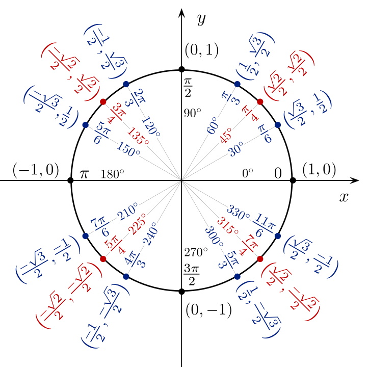 "Unit circle angles color" by Jim.belk - Own work. Licensed under CC BY-SA 3.0 via Wikimedia Commons.
Well... It is important to use it to create axis and it depends on number of metrics you want to display. Indeed, if you want to display 5 axis (= 5 metrics) you have to use differents formulas than 6 axis chart. In my case I used a 12 axis chart so I had to use several formulas (as on the image above).
Thanks to Internet I was able to find the different formulas and create a calculation in Tableau for X axis and Y axis.
Calculation for
Calculation for
It is very important to have the same
After the creation of calculations, I had to build the chart. To do this, I just have to drag and drop the

You can note that I use the aggregation Average (because Sum will returns a wrong result). Here I have only 1 point. To create the radar I have to use several dimensions (in my case,

After I can change the Mark to draw a polygon and add [Country] as a quick filter.

To have a beautiful radar, the last things to do are put [IndexType] as a Path to follow and Fix axis between -110 and 110 (or whatever you want to have enough space between borders and chart).

To give some design to my chart, I chose to remove grid lines, Zero lines and borders, and to hide headers. Moreover, I chose to give some trnasparency and a border to my polygon in order to have a more beautiful chart.

Finally, I drew a background image to have reference axis in order to give some visual impact. Indeed, I think it is better if you know where the maximum is.

To add beautiful tooltips, it is important to put AVG([Value]) on the Mark shelf and to configure the tooltip like this:

And "Voilà"! The radar chart is done!
Trigonometry, my best friend ever!

Well... It is important to use it to create axis and it depends on number of metrics you want to display. Indeed, if you want to display 5 axis (= 5 metrics) you have to use differents formulas than 6 axis chart. In my case I used a 12 axis chart so I had to use several formulas (as on the image above).
Thanks to Internet I was able to find the different formulas and create a calculation in Tableau for X axis and Y axis.
Calculation for
[Xaxis]
case [Dimension]
    when "Member 1" then 0
    when "Member 2" then [Value] *(1/2)
    when "Member 3" then [Value] *(sqrt(3)/2)
    when "Member 4" then [Value]
    when "Member 4" then [Value] *(sqrt(3)/2)
    when "Member 5" then [Value] *(1/2)
    when "Member 6" then 0
    when "Member 7" then [Value] *(-1/2)
    when "Member 8" then [Value] *(-sqrt(3)/2)
    when "Member 9" then [Value] *(-1)
    when "Member 10" then [Value] *(-sqrt(3)/2)
    when "Member 11" then [Value] *(-1/2)
end
Calculation for
[Yaxis]case [Dimension]
when "Member 1" then [Value]
when "Member 2" then [Value]*(sqrt(3)/2)
when "Member 3" then [Value]*(1/2)
when "Member 4" then 0
when "Member 5" then ([Value])*(-1/2)
when "Member 6" then [Value]*(-sqrt(3)/2)
when "Member 7" then [Value]*(-1)
when "Member 8" then [Value]*(-sqrt(3)/2)
when "Member 9" then [Value]*(-1/2)
when "Member 10" then 0
when "Member 11" then [Value]*(1/2)
when "Member 12" then [Value]*(sqrt(3)/2)
endIt is very important to have the same
[Value] scale for each [Dimension] members! Indeed, the 12 axis have to be the same. In my case the scale was from 0 to 100.Build the radar to detect everything
[Yaxis] on the lines shelf and the [Xaxis] on the columns shelf.
You can note that I use the aggregation Average (because Sum will returns a wrong result). Here I have only 1 point. To create the radar I have to use several dimensions (in my case,
[Country] and [IndexType]). The [IndexType] allows me to draw 12 axis because this is a dimension with 12 members; [Country] allows me to draw 1 radar by country. If I want to draw the average radar chart, I can remove the [Country] field. To have several points I add [IndexType] on the Mark shelf as a Level of Detail.
After I can change the Mark to draw a polygon and add [Country] as a quick filter.

To have a beautiful radar, the last things to do are put [IndexType] as a Path to follow and Fix axis between -110 and 110 (or whatever you want to have enough space between borders and chart).

Some Formatting and "Voilà"!

Finally, I drew a background image to have reference axis in order to give some visual impact. Indeed, I think it is better if you know where the maximum is.

To add beautiful tooltips, it is important to put AVG([Value]) on the Mark shelf and to configure the tooltip like this:

And "Voilà"! The radar chart is done!

Thank you for the reading!
7/17/2015
Which shape are you?
The Social Progress Index
Two weeks ago, I was browsing the Tableau community forum and I found an interesting question about reference line. The question was about to create a band reference line but just for few members in a dimension (Here is the question). This question drove me to an other question: Is it possible to create a "dynamic" reference line?
To answer it, I chose a dataset about Social metrics in the world: The Social Progress Index. With this dataset I tried to create a "dynamic" reference line.
As you can see in the visualisation below, when you click on a country on the map the reference line in the distribution graphic shows the average gap. The average gap is represented by a grey band calculated when the user click on a country. My idea was to show the gap when a country is highlighted and the average line in the other hand. To do this I used th LoD. It was just my second time with LoD... and it was very interesting!
The formula used in the LoD calculation allows me to calculate the general average: { EXCLUDE [Country]: avg([Value]) }. To build the reference band, I chose the average for each country as the end and my LoD calculation as the begin. The 9.0 version of Tableau allows me to show re-calculated reference lines when a mark is selected so I used it to redraw the reference band! Because in fact, the band is equal to 0 when no selection is provided. After this I chose to add some other graphics such as the radar graph to show the shape of each country and a map to allow the selection.
Feel free to leave a message or a note about this work!

Source: The Social Progress Index - Data
Thank you for the reading!
Subscribe to:
Posts (Atom)